Printing with Precision: How to Utilize Spot Colors for Optimal Results
August 15, 2023
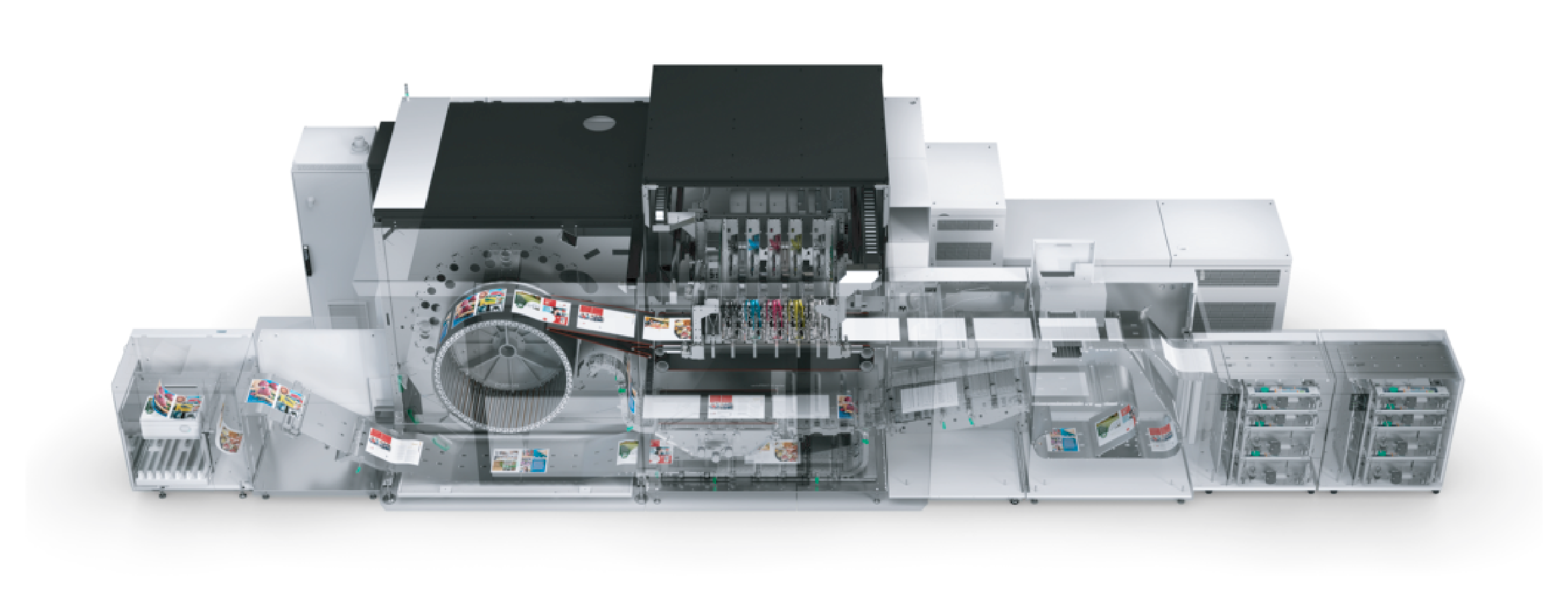
At Foresight Group, we are committed to delivering the highest quality prints that truly represent your brand’s identity. To achieve the utmost precision in color reproduction, we recommend using spot colors in your design files when printing on our cutting-edge Canon iX-3200 digital press.
Spot Colors vs. CMYK Mix: Understanding the Difference
Spot colors, also known as Pantone colors or PMS (Pantone Matching System) colors, are specially formulated ink colors that remain consistent regardless of the printing process. By using spot colors, you ensure that the exact shade you desire is accurately reproduced on paper, providing a vibrant and consistent appearance across all of your printed materials.
On the other hand, CMYK (Cyan, Magenta, Yellow, Black) is a process color model commonly used in offset and digital printing. It involves mixing these four colors in different proportions to simulate a wide range of colors. However, slight variations in CMYK mixing can occur, leading to color inconsistencies in the final output.
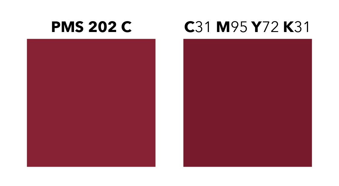
The Canon iX-3200 is a CMYK based printing press, but the advanced technology in the press will identify a spot color in your file and use the profiled CMYK mix for the specified spot color.
How to Prepare Your Files for Spot Color Printing
To take advantage of the precise spot color reproduction capabilities of our Canon iX-3200 press, follow these simple guidelines:
1. Use Pantone/Spot Colors: In your design software (e.g., Adobe Illustrator, InDesign, or Photoshop), choose Pantone/spot colors from the color swatches palette instead of creating colors using CMYK values.
2. Check Pantone Libraries: Ensure you have the most updated Pantone libraries to access the latest color formulations. This will help maintain accuracy and consistency across various printing projects.
3. Assign Spot Colors Correctly: Assign spot colors to specific design elements where they are intended to appear. Double-check your file to avoid any color overlapping, which could lead to unintended mixing.
4. Avoid RGB Colors: While RGB colors may look vibrant on screen, they are not suitable for spot color printing. Always convert RGB colors to Pantone/spot colors or a CMYK mix before submitting your files.
5. Provide Spot Color Callouts: In your design, include clear instructions specifying the use of spot colors. This will help our production team identify and process your files correctly.
Why Choose Spot Color Printing with Foresight Group?
Utilizing spot colors in your printing projects offers several benefits:
1. Consistent Brand Identity: Spot colors ensure your brand’s colors remain consistent across all marketing materials, reinforcing your brand identity and professionalism.
2. Accurate Reproduction: Our Canon iX-3200 press is meticulously calibrated to match the exact Pantone color formulations, guaranteeing true-to-life color representation.
3. Enhanced Visual Appeal: Spot colors create stunning, eye-catching prints that leave a lasting impression on your audience.
At Foresight Group, we take pride in our commitment to delivering exceptional print results. By following these spot color guidelines, you can rest assured that your printed materials will stand out for all the right reasons.
If you have any questions or need assistance in preparing your files, our dedicated team of experts is here to help. Contact your sales rep to discuss your printing needs further.